plot(final$Number.of.Bales, final$Cost.Per.Pound)
cor(final$Number.of.Bales, final$Cost.Per.Pound)
cor(final$Number.of.Bales, final$Cost.Per.Pound)^2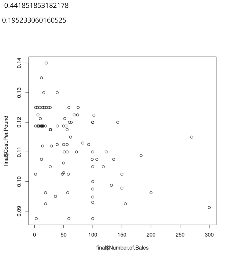
The first line of code uses the plot() function to create a scatterplot of the data for the number of bales and the cost per pound from the Bates Mill Company Financial information dataframe. The scatterplot above shows this data. While it is pretty spread out, it is clear that there is a general downward trend — meaning that as cost per pound increases, number of bails decreases. The first number displayed above the graph, -0.44185, represents this correlation proving that it is a fairly weak and negative relationship. The second line of code calculates this number using the cor() function and the same data used in the scatterplot. The third line of code uses the same cor() function but squares the value in order to calculate how much of the variation of the number of bales of cotton can be explained by the cost per pound. The calculation was fairly low, 0.19, which means that only about 20% of the variance of the number of bales is a result of the cost per pound.